
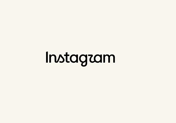
Instagram has changed its logo for the first time in a decade, and the internet immediately found a problem with it.
Or, at least, a funny one.
The redesigned Instagram wordmark is supposed to look “sharper and more modern,” according to Instagram chief Adam Mosseri. Instead, some users say the stylized letters make the name look like “Instagzam,” “Instagwam,” or even “Instaguam.”
But there is an important detail behind all the jokes: Instagram has not actually changed the familiar app icon that millions of people recognize every day.
The pink-and-orange gradient camera icon remains the same. What changed is the wordmark, the written “Instagram” displayed at the top of the app and across parts of its brand system.
That distinction makes this more interesting than a simple logo refresh. It raises a bigger question about how major technology companies evolve their visual identities without disrupting the symbols people already recognize.
Instagram's 2026 Logo Update: What Actually Changed?
The most important thing to understand about Instagram’s 2026 logo update is that the company changed its wordmark, not its primary app icon.
A wordmark is the written version of a brand’s name. In Instagram’s case, it is the “Instagram” lettering that appears at the top of the app and across various branded materials. The familiar pink-and-orange gradient camera icon that users see on their home screens has not been replaced.
The main visual change is in the lettering itself. Instagram has introduced a refreshed wordmark with more cursive-inspired curves, particularly around letters such as “s,” “r,” and “g.” The intention is to make the branding feel cleaner, sharper, and more modern while still maintaining a visual connection to Instagram’s earlier identity.
The update also goes beyond the wordmark. Instagram describes it as part of a broader brand system refresh, which includes updated fonts, icons, and visual formats.
In other words, this is not a complete replacement of Instagram’s visual identity. The core symbol that users immediately associate with the platform remains intact, while the typography and surrounding brand elements have been refined.
So while “Instagram changed its logo” is an easy way to describe the news, a more technically accurate explanation is:
Instagram refreshed its wordmark and broader brand system while leaving its recognizable app icon unchanged.
Why Instagram Changed Its Logo After 10 Years
According to Adam Mosseri, the reason was straightforward: the wordmark had been unchanged for roughly a decade and had started to feel dated.
Instagram wanted something that felt cleaner, sharper and more modern while still referencing the brand's original design language.
That is a familiar strategy in technology branding.
Instead of throwing away everything users recognize, companies often make smaller changes to typography, spacing, colors or shapes. The objective is to make the brand feel current without forcing customers to relearn what the product looks like.
Instagram's approach is particularly conservative because its icon has enormous recognition value.
A user doesn't need to read “Instagram” to recognize the pink-and-orange square on a phone screen. The shape and gradient have become the shortcut.
That makes the icon considerably more valuable, and considerably riskier to change.
The Big Difference Between 2016 and 2026
Instagram’s 2026 branding update is much more subtle than the company’s previous major redesign in 2016.
In 2016, Instagram completely replaced its old skeuomorphic camera icon, which featured a brown camera body and a rainbow stripe. It was replaced by the flat pink, purple, orange, and yellow gradient camera icon that users still recognize today.
That change represented more than a new visual style. The old camera design was closely connected to Instagram’s original identity as a relatively simple photo-sharing app. By 2016, however, Instagram had grown into something much larger, and the new gradient icon gave the brand a more modern and flexible identity.
The 2026 update takes a very different approach. Instead of replacing the familiar camera icon, Instagram has kept it intact and focused primarily on the wordmark and broader typography system.
The contrast is significant. The 2016 redesign changed one of Instagram’s most recognizable visual symbols and therefore represented a major shift in the company’s identity. The 2026 update preserves that symbol and mainly refreshes the way the brand name is presented.
This also explains why the two redesigns have generated very different reactions. The 2016 change triggered widespread debate over Instagram abandoning its familiar camera, while the 2026 controversy has focused largely on the readability and unusual appearance of the new lettering, including the viral “Instagzam” jokes.
There is also an interesting irony here: Instagram’s product has arguably changed more over the past decade than its visual identity.
The platform has expanded from primarily photo sharing into a much broader social platform centered around short-form video, messaging, algorithmic recommendations, shopping, creators, and increasingly AI-powered features. Yet the gradient camera icon has remained almost unchanged throughout that transformation.
That stability may be exactly why Instagram chose not to replace it in 2026. The icon has become one of the strongest visual shortcuts associated with the platform, while the wordmark can be refreshed without forcing billions of users to relearn what the app looks like.
Why People Are Calling It “Instagzam”
The internet's biggest reaction wasn't about branding strategy.
It was about one letter.
Several users argued that the stylized “r” in the new wordmark can look more like a “z” or another character, especially when viewed quickly or at a small size.
That led to jokes that Instagram now reads:
“Instagzam”
“Instagwam”
“Instaguam”
One commenter asked whether they were the only person seeing “Instagzam,” while another joked about “Instagwam.”
The reaction was not universally negative, though.
Some designers and branding observers appreciated the refreshed look. Social media consultant Matt Navarra described the redesign positively while acknowledging the “Instagzam” joke.
That split is important.
A controversial typeface isn't automatically a bad typeface. Brand design often produces strong opinions precisely because people interact with typography differently depending on size, context and familiarity.
The more serious question is whether the new lettering remains immediately legible across the places where Instagram needs to use it.
Is Instagram's New Wordmark a Readability Problem?
This is where the online criticism becomes more interesting than the jokes.
A logo can look beautiful in a presentation while performing poorly in real-world environments.
Instagram's wordmark needs to work across:
Smartphone screens
Small app headers
Marketing graphics
Websites
Social media posts
Advertisements
Different display resolutions
Different languages and writing systems
At large sizes, the new curves may be obvious design details.
At smaller sizes, those same curves can become visual noise.
This is a classic typography challenge: the smaller a wordmark becomes, the less room there is for decorative detail.
Some users even questioned whether the new design meets accessibility expectations. The available reactions do not establish that the wordmark actually fails an accessibility standard, but the criticism highlights a legitimate design question: does the branding remain easy to recognize and read in practical contexts?
That distinction matters.
Aesthetic appeal vs. functional readability
A useful way to evaluate the new wordmark is to separate two questions:
Does it look distinctive?
Probably.
Does it remain instantly readable everywhere Instagram uses it?
That will require more real-world testing.
A brand identity isn't successful simply because designers like it at full size. It needs to survive the messy conditions in which ordinary users encounter it.
Why Instagram Kept the App Icon
The decision to leave the app icon untouched may actually be the most significant part of this update.
The Instagram icon has become a powerful recognition signal.
People don't necessarily search for an app by reading its name. They identify it visually.
The gradient square works at a glance, even when reduced to a tiny icon on a crowded phone screen.
Changing that symbol would therefore carry much greater risk than changing the wordmark.
A wordmark can be updated without changing how people find Instagram on their phones.
That gives Meta a relatively safe way to refresh the brand.
In practical terms, the strategy looks like this:
Keep the high-recognition symbol → refresh the typography → modernize the surrounding brand system → avoid forcing users to relearn the product's visual identity.
It's a much less disruptive approach than the 2016 redesign.
What Designers Can Learn From Instagram's Refresh
For designers and developers, Instagram's update offers a useful branding lesson.
1. Recognition can be more valuable than novelty
A company doesn't need to redesign everything simply because a brand feels old.
Sometimes the strongest asset is the part that shouldn't be touched.
Instagram appears to be protecting its most recognizable visual element while updating a less critical one.
2. Typography is part of product design
A wordmark isn't just an image placed on a page.
It has to work inside interfaces, advertisements, websites and different screen sizes.
That means designers need to consider readability and scaling, not just visual personality.
3. Small changes can generate huge reactions
The actual change is relatively small, but social media discussion quickly turned it into a major conversation.
That's the nature of recognizable brands.
When billions of people are familiar with something, even a minor change can become instantly noticeable.
4. Heritage doesn't mean copying the past
Instagram's new curves appear to reference its original script-style identity without simply bringing the old logo back.
That is a common branding technique: take a recognizable element from the past and reinterpret it for a modern system.
The challenge is making the reference feel intentional rather than nostalgic.
Final Takeaway
Instagram's 2026 logo update is less dramatic than the 2016 redesign, but that may be exactly the point.
The company changed the part of the identity that could be refreshed relatively safely while protecting the visual symbol people already recognize instantly.
The new wordmark introduces a more modern, curved style and reconnects Instagram with elements of its earlier identity. At the same time, its unusual letterforms have sparked criticism over readability, producing the now-viral “Instagzam” jokes.
Whether the redesign succeeds won't ultimately be decided by Instagram's announcement or social media comments.
It will be decided by something much simpler:
Can people still recognize and read “Instagram” instantly, at every size and everywhere the brand appears?
For now, Instagram has changed its font.
The thing you actually tap is still the same.